Design System and Design Hand Off
- Dec 15, 2022
- 4 min read
Updated: Mar 25, 2025
Since 2020 I’ve taken over the UX team lead role as part of a small 4-man squad under Product Development department. In the year 2020, I lead and drive the Creative App - a new modular app platform for Creative products, which has been launched in 2021 in Creative.com, App Store and Google Play Store on Windows, macOS, iOS and Android platforms.

In the design process of the Creative app, I've built up a design system as well as refined the hand off process between designers and developers. In 2018, I recommended the Sketch app to my UX team to substitute the Adobe Illustrator and Photoshop, as the key design tool, with the Zeplin app to both the design team and developer team for a more efficient handoff. The adoption of Sketch and Zeplin has largely improved the efficiency and quality of design, which allows a 4-man design team takes responsibility of design for app and also the firmware. However, there wasn't a well-established design system and library in the earlier. When came to 2020, I was appointed as the lead to drive a new brand-new app, and I saw the opportunity to establish such a design system and a design library for team collaboration. Meanwhile, working from home as a norm during covid period urged a way of design collaboration even for a small team.
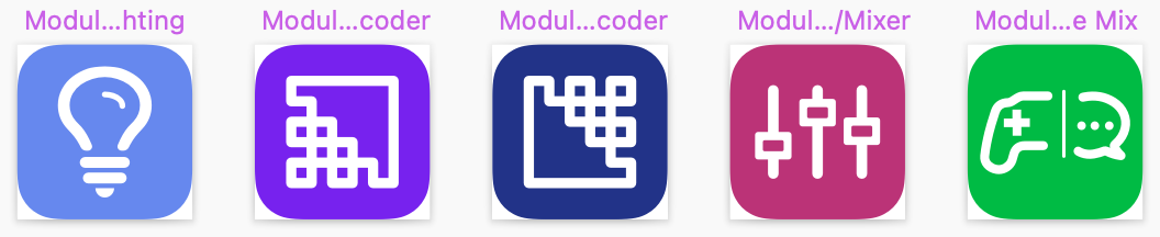
Referring to the Atomic Design, there are five distinct stages of the design, which is atoms, molecules, organisms, templates, and pages. This is comprehensive. Yet considering that my team is a small squad, I construct a design system with three types of files - iconography library, app design library, and app UI files. Each of them contains certain elements of the design system to a certain level of the design stages.

Iconography Library
The iconography library only have a single file, which stores the icons, image assets, and illustration assets. These assets are shared among the different platforms, e.g. a delete icon are identical on all platforms (but each might has a different size according to its button sizes). Each of icon would come as a pair, one in black for light theme and the other one in white for dark theme. For certain icons, there is some other states, e.g. focused, selected and disabled, which would be achieved by override the color when use as an instances in the pages in each desgin file.


By seperating the iconography library from the rest library and design files, it ensures design consistency from the source and also improves the iconography maintainance efficiency. From 2021, after switching over to the workspace of Sketch, updating the icon in the iconography library would notify all the design files which contains an instances of the icon and update it by a single click.
App Library
App library are the files to manage the reuseable components, color themes and font library. As known to the designers, Android, iOS and Windows are having their own design guidelines for the apps, including the compenets' dimensions, font familiy and sizes, and etc. As a result, the App library are done per each platform. Accross the platforms, some elements are still on par, such as the color themes.
Maintaining the app libraries per platform ensures that the componenets are consistent across all the screens of a platfrom. There are two tips when constructing the app library:
First, the color and text of each elements of the components shall link to a layer style or a color style. If the component contains a placeholder icon, the placeholder icon shall link to a symbol of iconography library. This would make the colors and icons of the components can change its override when it's inserted as an instance in the design file.
Second, the components should be set up nicely on its resizing rule and the elements of the components should be set up for its margin and size when the components is resized.


App UI Design File
Finally, all the screens would be done in a single design file per each platform. Though the designs are draw in seperate screens, the screen information structures are consistent across the different platforms, which should follows with the wireframes. This design file are constucted by the components of app library and the icons of iconography library, except the screen templates are maintained locally:
Color style links to the app library file
Text style links to the app library file
Components links to the app library file (e.g. app bar, tool bar and buttons)
Icons and image assets links to the iconography library
In the app UI design files, designer can use the override function of the Sketch’s symbol to replace the icons, colors and text styles according to the need, and resize the components in its defined resizing way in the library files.
Handoff

We team are using Zeplin as the handoff tool between designers and developers. It saves large of time for dimension notation and assets slices exportation. In the past days, designers have to manually mark down the dimension for each individual elements or margins or padding and also have to export the assets in different format for each platforms. With the Zeplin, after the new screens are reviewed and approved for design release, designers can publish the screens from Sketch to Zeplin into the corresponding projects in Zeplin, which are set up for iOS or Android or macOS or Web specially (use the Web for Windows platform). Since all the UI elements of app UI design file are linked to the libraries, which would automatically export the assets according to the platform for every instance of a symbol.
Tips: The instance has to link to a symbol. Once it’s detached, Zeplin wouldn’t recognize it as an assets unless its export options are ticked in the Sketch.